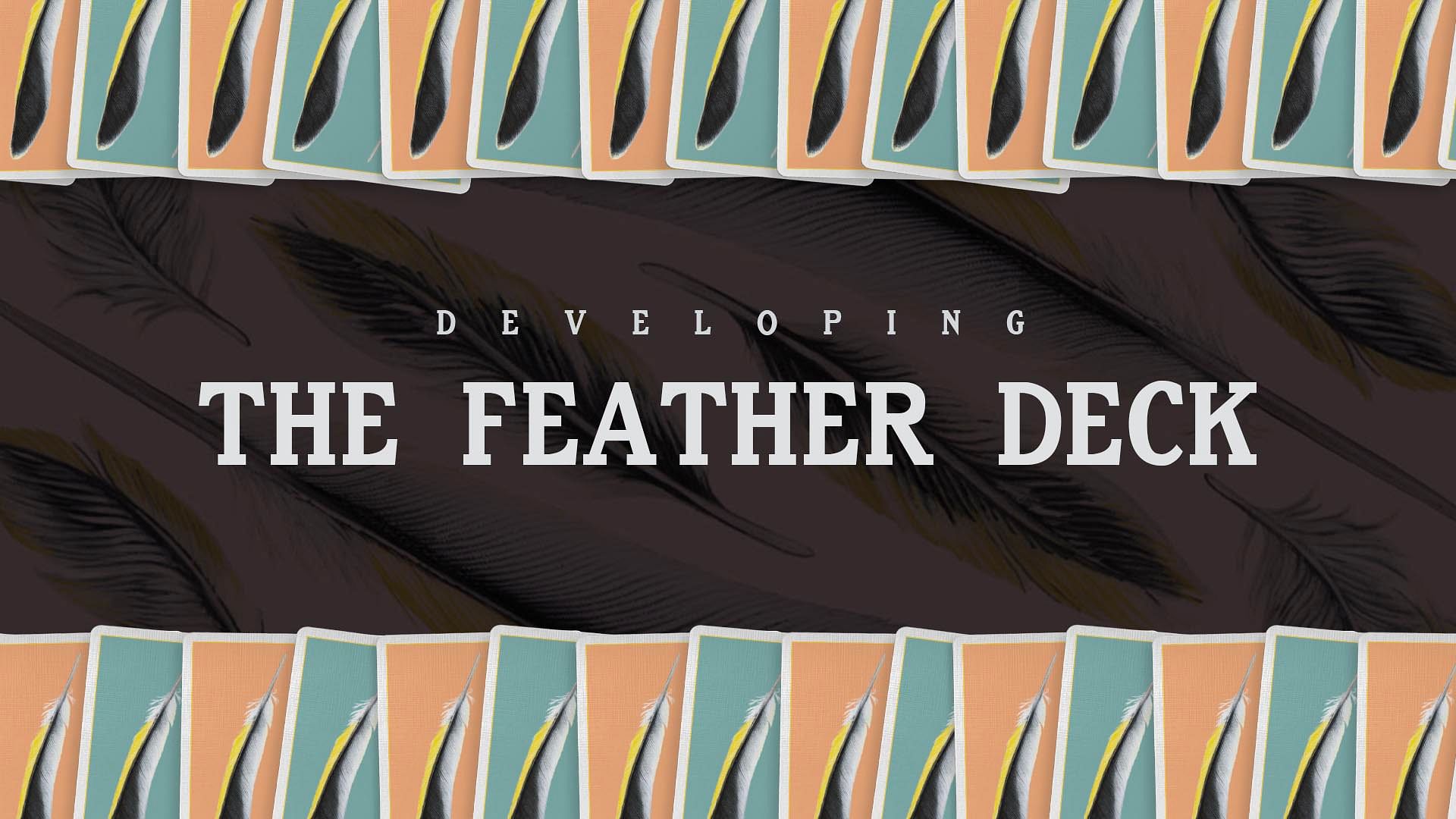
Developing the Feather Deck
By Joshua Jay - Friday, April 9, 2021
As we celebrate the release of what I think, objectively, is our most beautiful deck yet released, I wanted to share how it came about and my own insecurities when it comes to deck design.

The goal is always creating a deck that celebrates my vision (and, most importantly, our company's vision) for what artful sleight-of-hand looks like. But as someone who isn't entirely playing card-crazy and obsessed with collecting decks of cards, I'm disappointed in the crass commercialism of most decks that get released. It seems to me that the aesthetics of custom playing cards are easy to throw together but, conceptually, many deck projects are shallow or vapid or directionless. Would it be possible, I wondered, to create a deck that was aesthetically attractive, but also conveyed a deeper subtext.
I think the Feather Deck achieves this. The ad copy sounds a little heavy-handed, but it's all true:
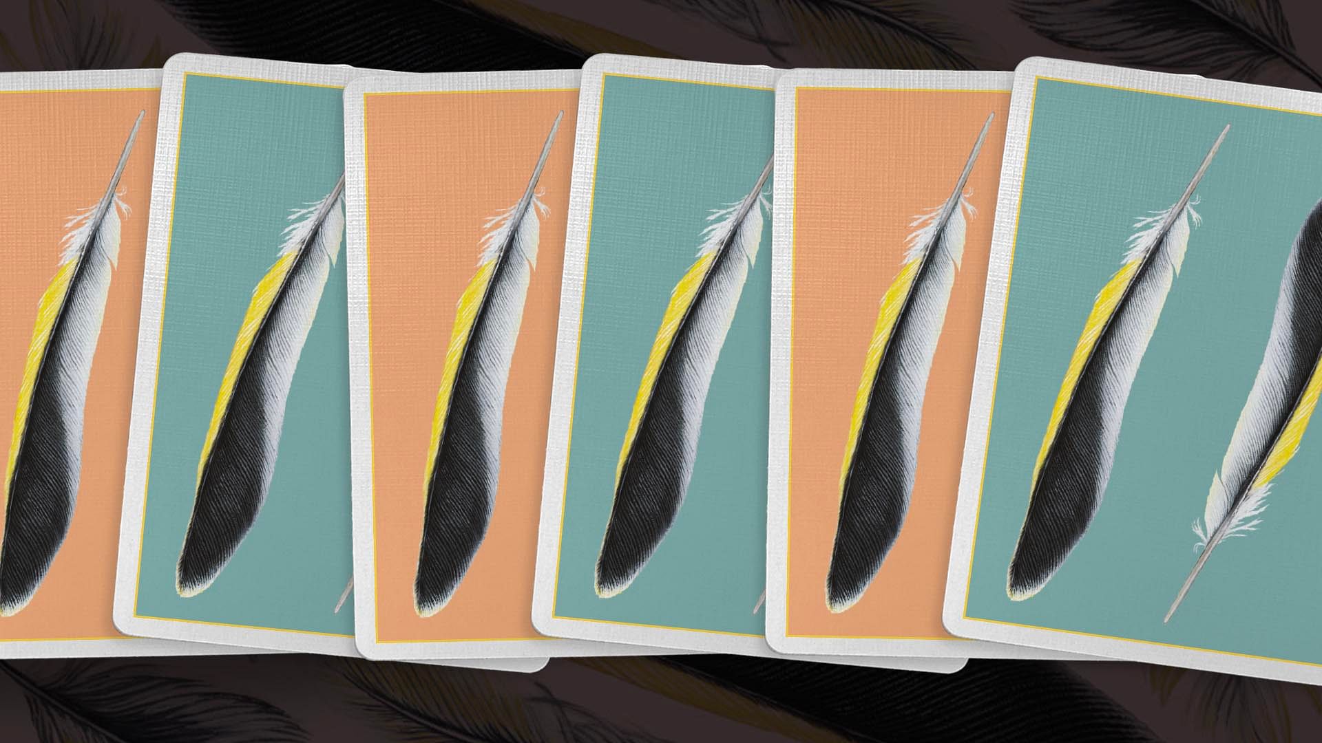
At first glance, the back design looks like a photograph of a feather. But what you're seeing is a remarkable hand-drawn rendering of a feather, with nearly a thousand individual pen strokes on the bristles alone, from Travis Demello— a renowned Brooklyn-based artist who specializes in incomprehensibly small details on anatomical drawings. The resulting Feather Deck is a pack of cards that celebrates the splendors of the natural world through the lens of human artistry. And what is magic if not EXACTLY that?
Feathers are beautiful but they are also tools. Moved in just the right way, at just the right angle, feathers fly. And this is the thrust of the Feather Deck: cards can be beautiful and aesthetically attractive, but at their core they are our tools, to elevate our work to new heights.
With the Feather Deck, we have sought a delicate balance between an embrace of the natural world's perfection, but expressed in a way that is undeniably artistic and man-made. We hope that when used in your own work, you'll find this same balance with your magic.
Here's how it happened...
I encountered the work of Travis Demello, who is known for his precision-designed, anatomical drawings: seashells, frogs, the inner-ear...things like that. I expressed my desire to work on a deck of cards, and how I felt there was a special something about a feather that felt right as an emblem of sleight-of-hand. He agreed, and set to work.

Travis works entirely by hand during the drafting process, and as we started receiving early specs of the artwork, we were astounded because his drawings looked...like photos. In fact, one of our fears with this project was that, to the casual observer, the back design just looks like a photo of feathers. But when you look closer, I believe the artistry leaps off the page. You realize you're holding the work of an exceptional artisan.
Materials played a role, too. Everyone says this about their deck projects—and I'll say it too. We wanted the finest materials, the best finish, the most pliable stock. And we got there. I would encourage everyone to open a Feather Deck and manipulate it for five minutes to feel the difference. The gold foil accents on the design also add a particular touch of sophistication.
I realize people have their own taste for what they seek out in a deck of cards, but what I'm most proud about with the Feather Deck is that we've managed to straddle two concepts at the same time: a gorgeous-looking deck of cards that also has some meaningful heft behind it.
Grab your Limited Edition Deck

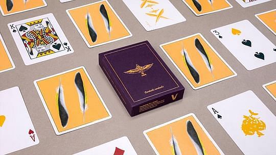
The Feather Deck is a limited edition release available in two stunning colors: gold and teal. Only 3,500 decks were ever printed. Get yours now!
Get the Feather Deck
Back to blog homepage
Similar posts on the blog:

