The Evolution of Principia
By Harapan Ong - Monday, March 9, 2020
I would like to share some interesting behind-the-scenes images from Stefan Eriksson regarding how the Principia logo came to be. This is a timeline of how the Principia logo evolved.
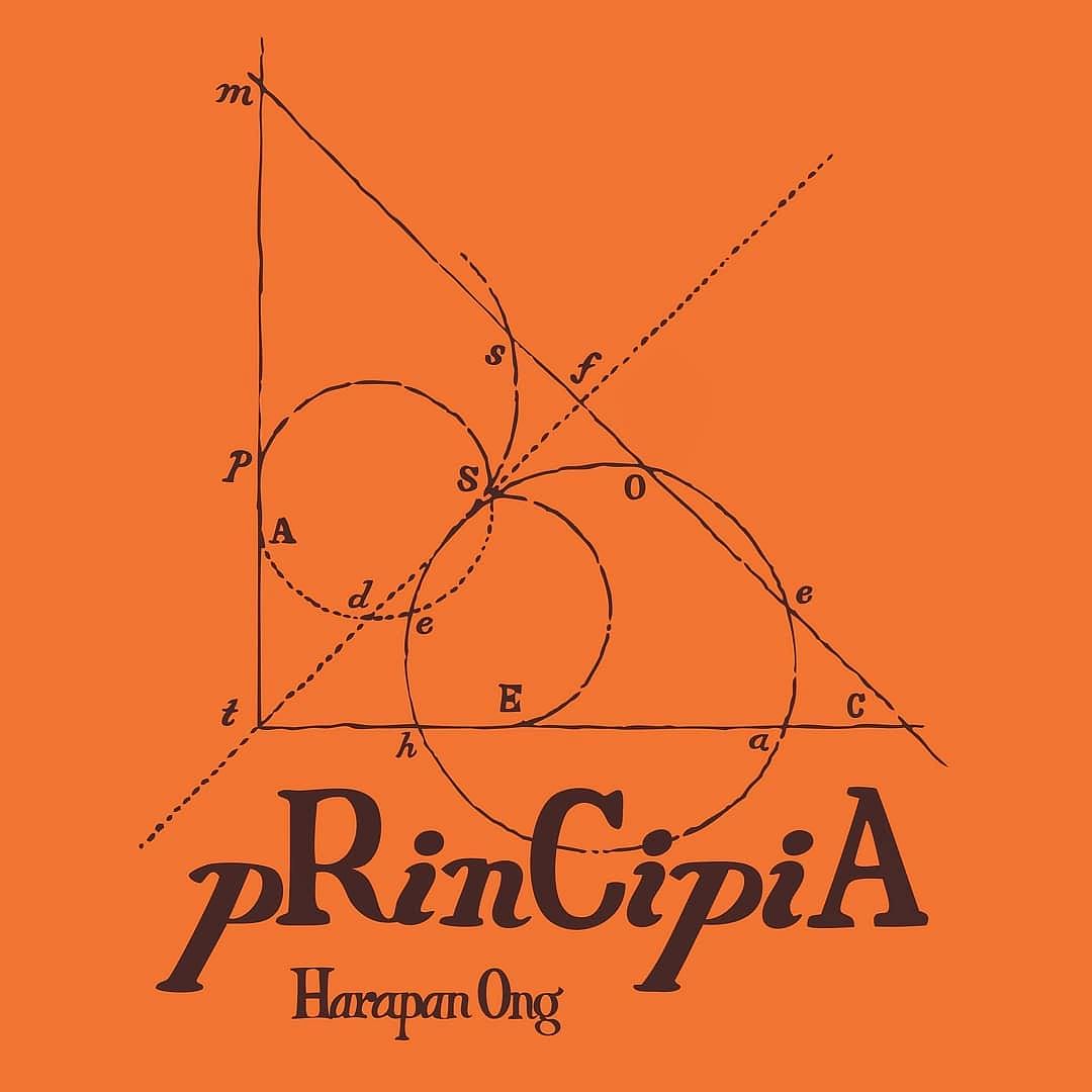
- The iconic Principia logo, designed by the very talented Stefan Eriksson from Sweden. The logo was designed to look like a physics/math diagram straight out of a textbook, and the orange was chosen to be eye catching and unconventional.
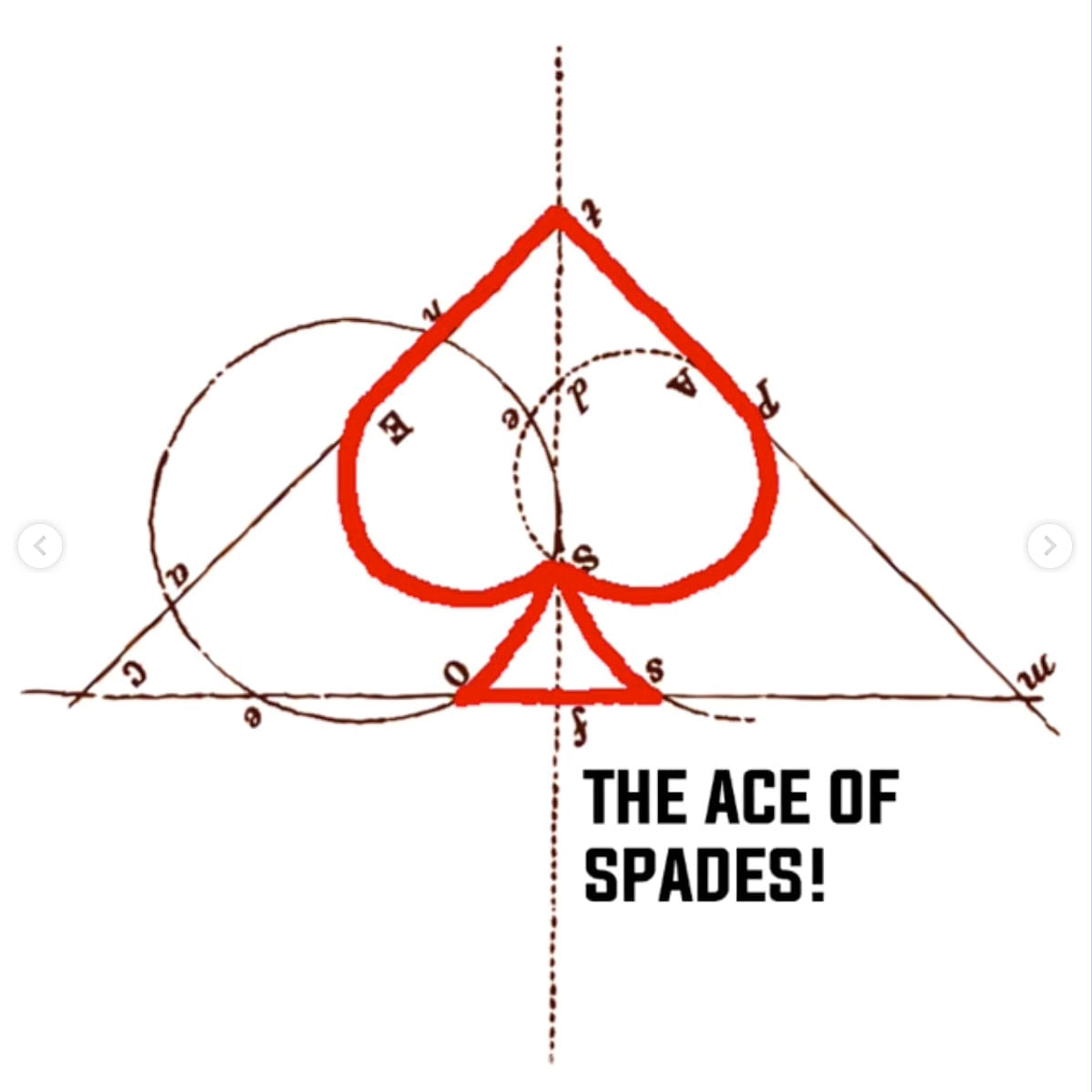
- Did you notice the hidden Spade before you saw this? How about the fact that the letters spell the words "The Ace of Spades".
3 The starting point. Stefan started playing around with existing mathematical diagrams with varying complexity.
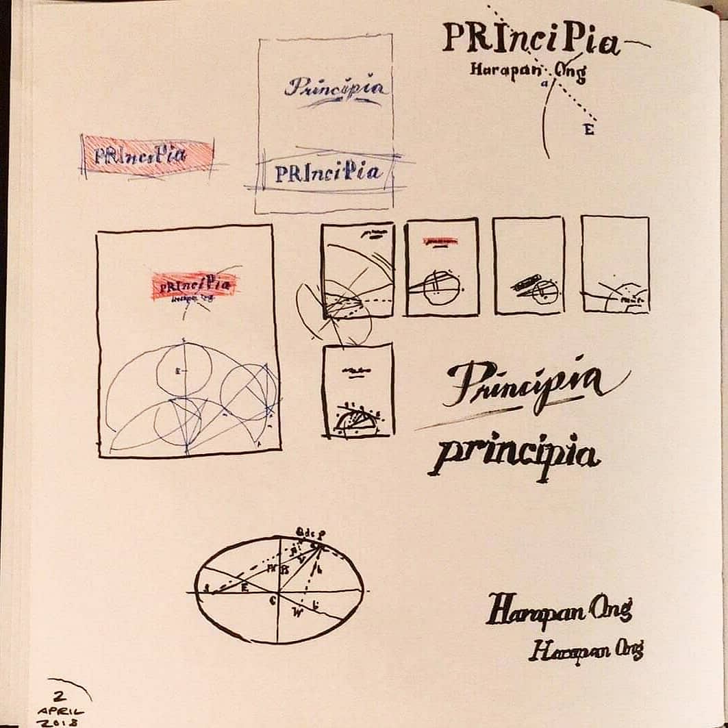
- We settled on varying the capitalization of the Principia title, but the diagram seemed unconnected to the theme of card magic.
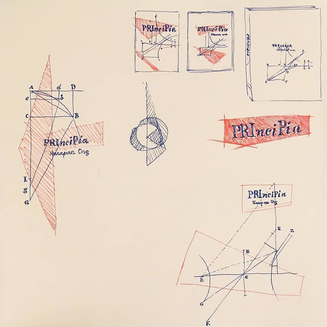
- Stefan tried to link it up by including playing cards at the intersection points. Not quite what we were looking for.
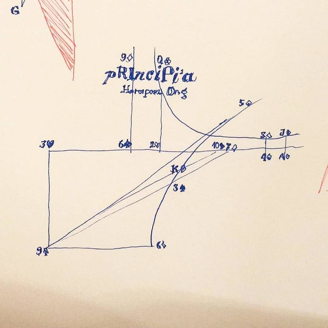
- We hit upon the brilliant idea of having the lines in the diagram form the shape/sketch of a playing card. Stefan tried a Queen, but eventually settled on an Ace of Spades!
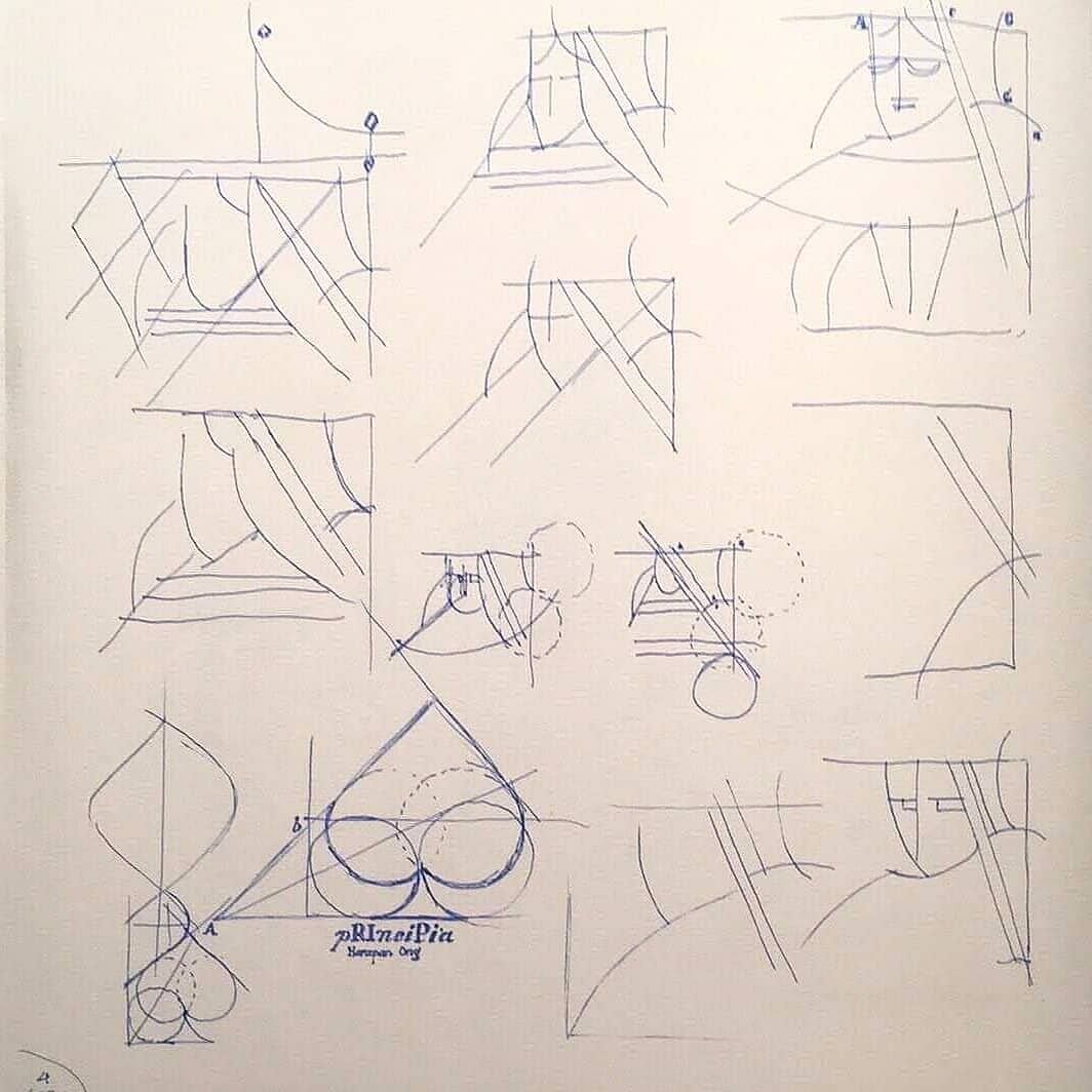
- Stefan attempts to hide the Spade by rotating it, to make it more of an Easter Egg for the observant eye!
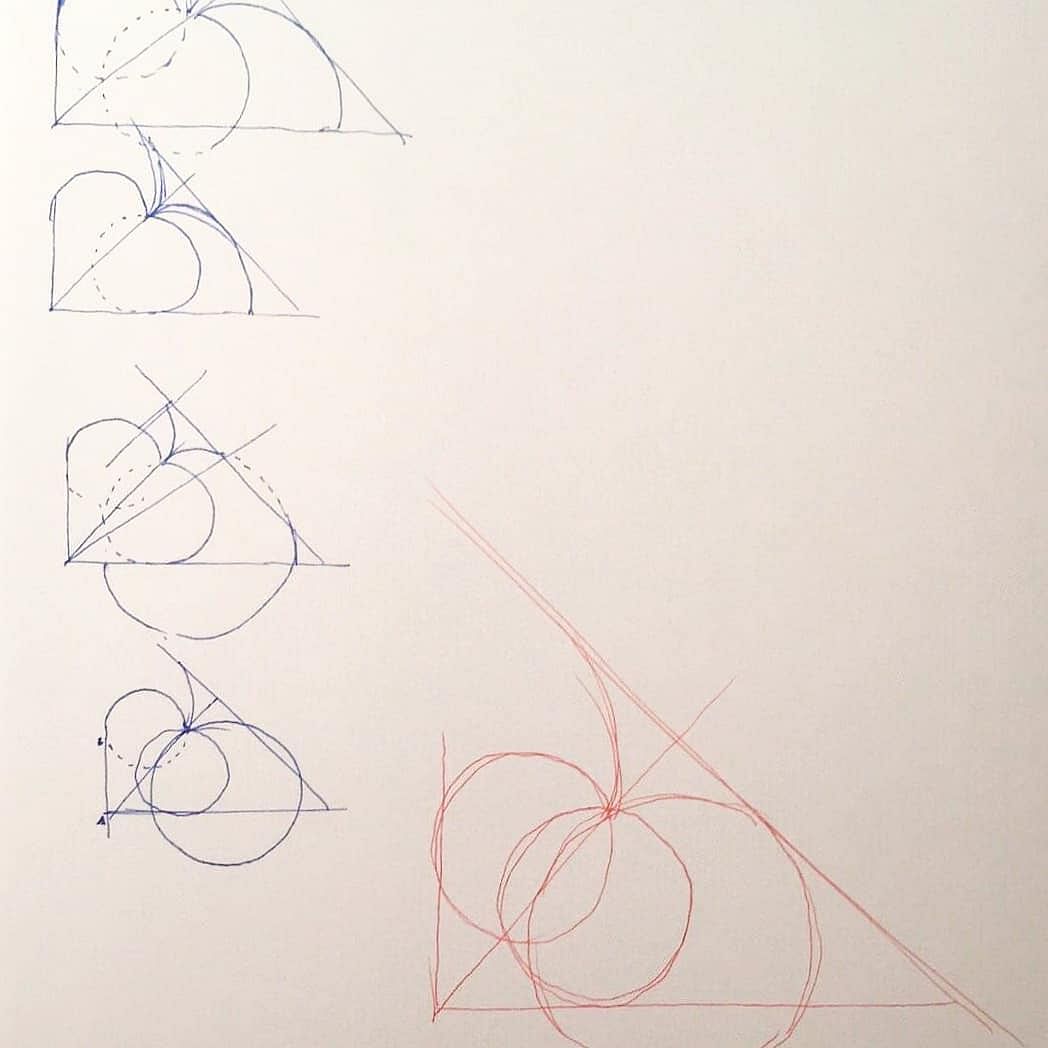
- Very close to the final result! The letters now spell The Ace of Spades.
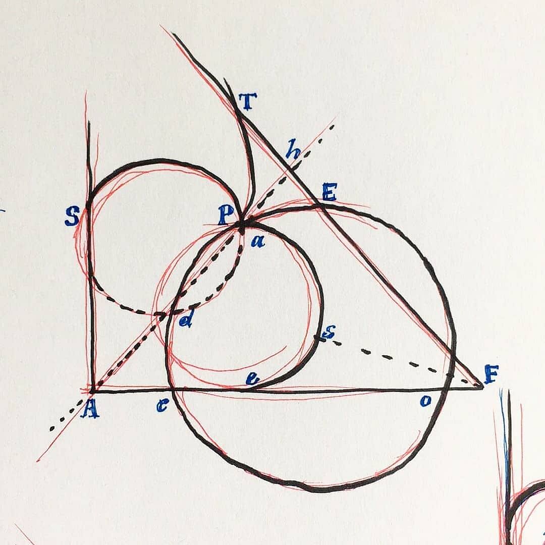
- Trying different placements of the logo and the title. I soon realized that the capital letters in Principia spelled RIP, so I had Stefan change that!
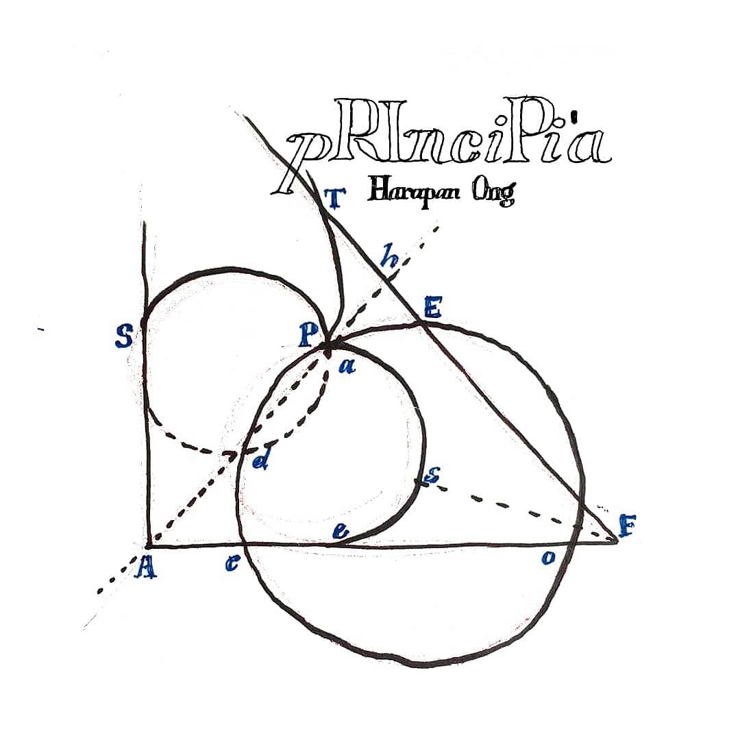
- The final result. Beautiful.

Moral of the story: good ideas + working with talented people is a great formula for success. Ideas evolve for the better with good communication between people passionate about what they do, so don't be afraid of change!
Was there a particular sketch in these images that you liked? Let me know! Meanwhile, Principia (along with the gimmicked cards) is still available. Click here to get hold of a copy.
Back to blog homepage
Similar posts on the blog:
